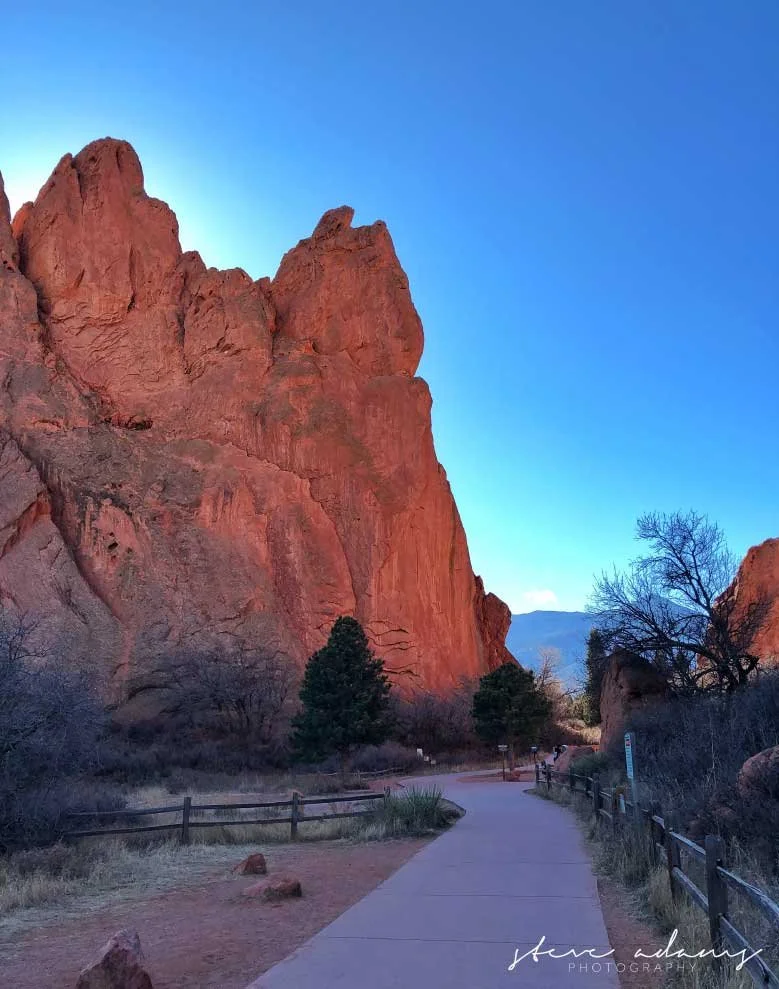
Stop Muting Your Photos! Why I Still Shoot in Full, Vibrant Color
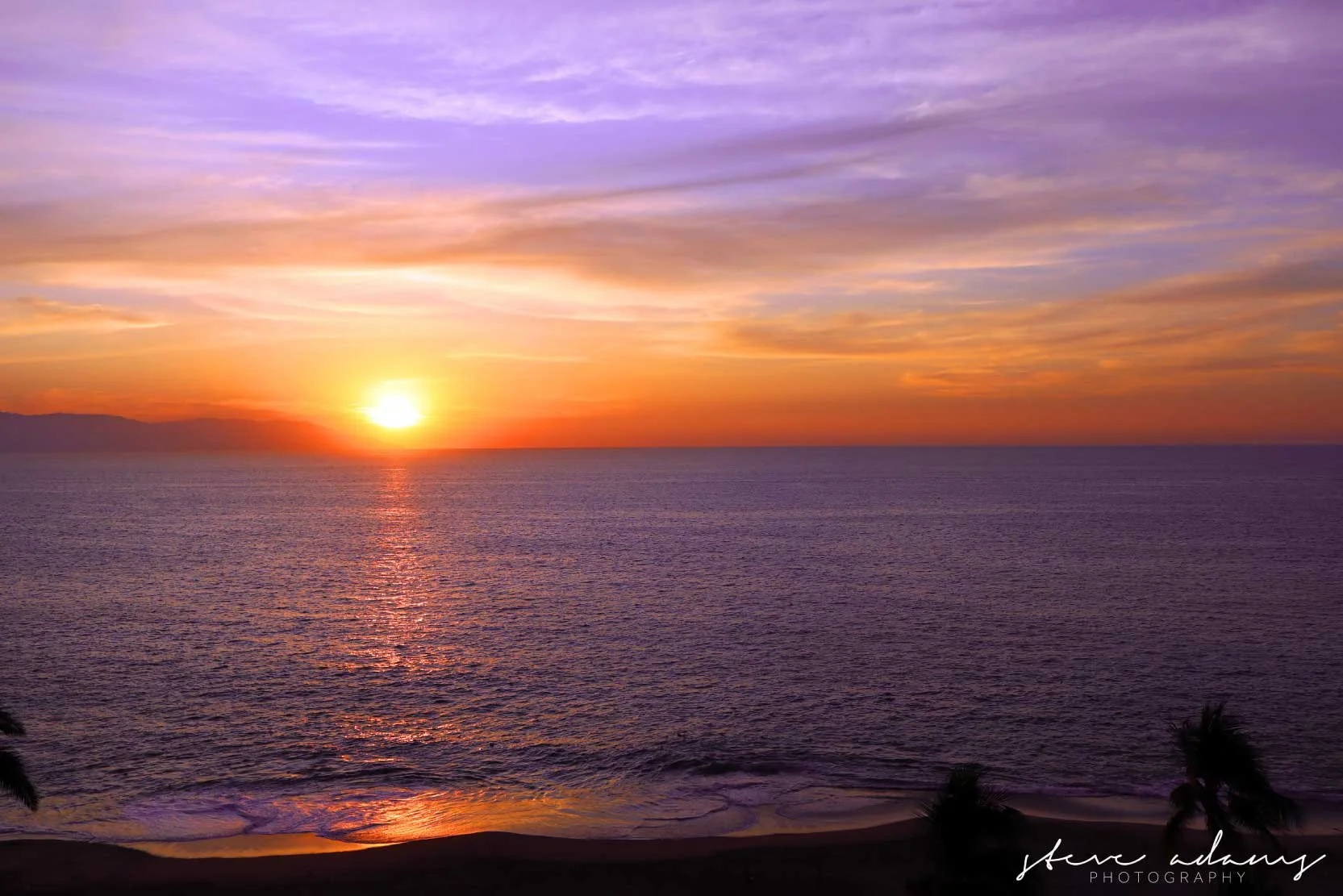
If you scroll through Instagram for more than a few minutes and you'll start to notice it everywhere. Photo after photo, all pulled toward the same washed out, faded, heavily filtered version of reality. The blues get muted. The greens get flattened. Skies that were actually electric and alive on the day someone photographed them come out looking like they were shot through a thin layer of fog. Everyone is chasing the same moody, albeit more cohesive look, and honestly, a lot of it has started to blend together into one long scroll of sameness.
I understand the appeal, I really do. A muted, film inspired aesthetic can be beautiful when it's used with intention. But somewhere along the way, it stopped being a creative choice for a lot of people and became more of an obligation. We started to care more about a trend, the newest app or fitting a “vibe” vs the truth, or the truest expression of what we photograph. A trend everyone felt like they had to follow just to fit in, to look like they belonged in the same feed as everyone else's carefully curated grid. And I think a lot of photographers, especially newer ones still figuring out their own eye, are pulling the color out of their images not because it makes the photo better, but because it makes the photo look more like what's already popular.
I'm not going doing that. I never really have. There is artistry in the editing of photos - that is for sure, but the moment you lose the truth its not really worth it.
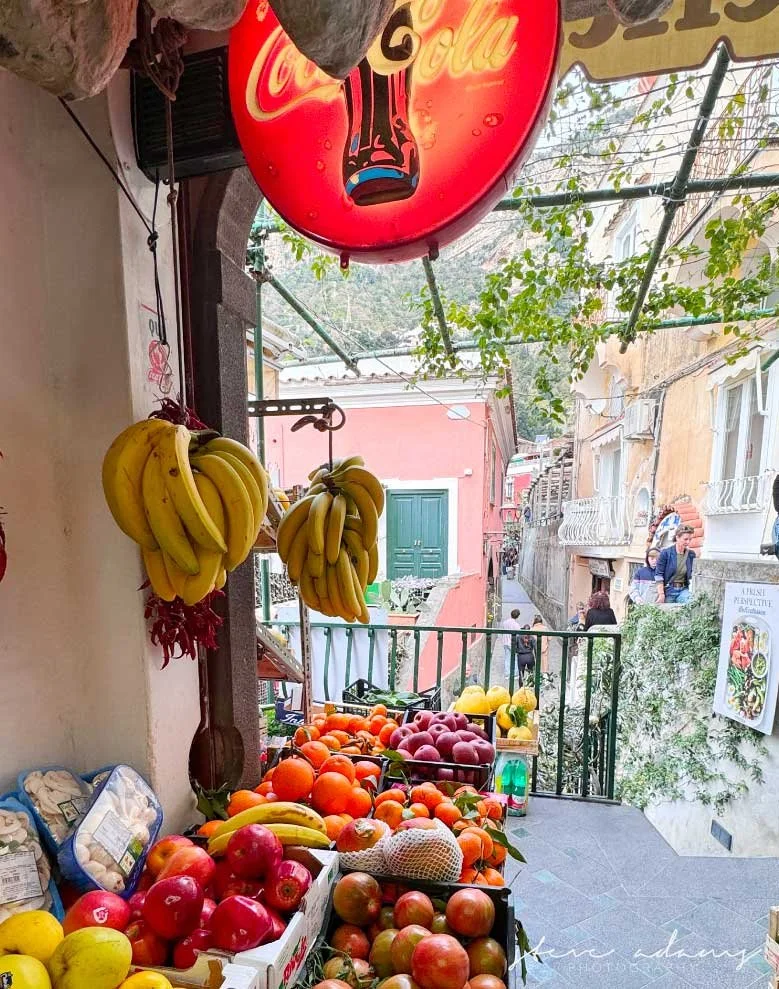
Positano reaffirmed this lesson
I've written before about how long I dreamed about photographing Positano, and about that first morning I sat on our balcony and finally saw it with my own eyes after thirty years of imagining it. What I haven't talked about as much is what that place actually looks like once you're standing in it. It is not muted. It is not covered in a filter, faded around the edges. Positano is loud with color. The buildings are this stacked wall of pink and yellow and terracotta orange, climbing straight up the cliffside against water that is such an aggressive, saturated blue it almost looks unreal in photographs even when it hasn't been touched at all.
If I had pulled the saturation down on those photos to fit some trending aesthetic, I would have been lying about the place. I would have handed you a quieter, sadder version of a town that is anything but quiet or sad. Positano earned every bit of that color honestly, and it would have felt disrespectful to mute it just because muted was what was popular that particular month online.
That trip reminded me of something I think a lot of photographers lose sight of somewhere along the way. Your job isn't to make a place look like everyone else's version of it. Your job is to show people what you actually saw, what inspires you and what brings you in the .
Filters are a tool, not a personality
I want to be clear about something, because I don't want this to come across as me being against editing or against filters entirely. I use both. Every photographer does, whether they admit it or not. A good filter, used with intention, can pull a photo closer to how a moment actually felt rather than just how a sensor happened to record it. That's the whole point of a filter in the first place. It's a tool to help you tell the truth about a moment more clearly, not a mask to hide behind.
The problem starts when a filter becomes your whole identity as a photographer instead of a tool you reach for occasionally. When every single image, no matter the place, the light, the mood of that particular day, gets run through the exact same preset until it all starts looking interchangeable. At that point you're not making creative choices about each individual photograph anymore. You're just running everything through a machine that spits out the same result every time, and the actual place you photographed barely matters because it's going to look the same regardless of what was actually in front of you. All so you get the “perfect post”. *hard eye roll
I'd rather my photos look a little different from each other, honestly, because the places I photograph are different from each other. Positano should not look like the Cotswolds. A sunrise should not look like sunset just because they both got run through the same filter. Let the place dictate the color, not the trend.
Vibrant color isn't a mistake, it's honesty
Vibrant color used to be the standard in photography. Then tech took over, apps were created to make updates easier for the novice.
I think there's a quiet assumption floating around online right now that vibrant, saturated color is somehow less sophisticated than muted tones. That if your photos look bright and full of life, you must not know what you're doing yet, and once you develop your eye a little more, you'll naturally gravitate toward something softer and more subdued.
I don't buy that, and I never have. Some places in this world are genuinely, wildly colorful, and pretending otherwise in the edit isn't more sophisticated. It's just less true.
When I mute a scene like that down to fit an aesthetic, I'm not making a more refined choice. I'm making a less honest one.
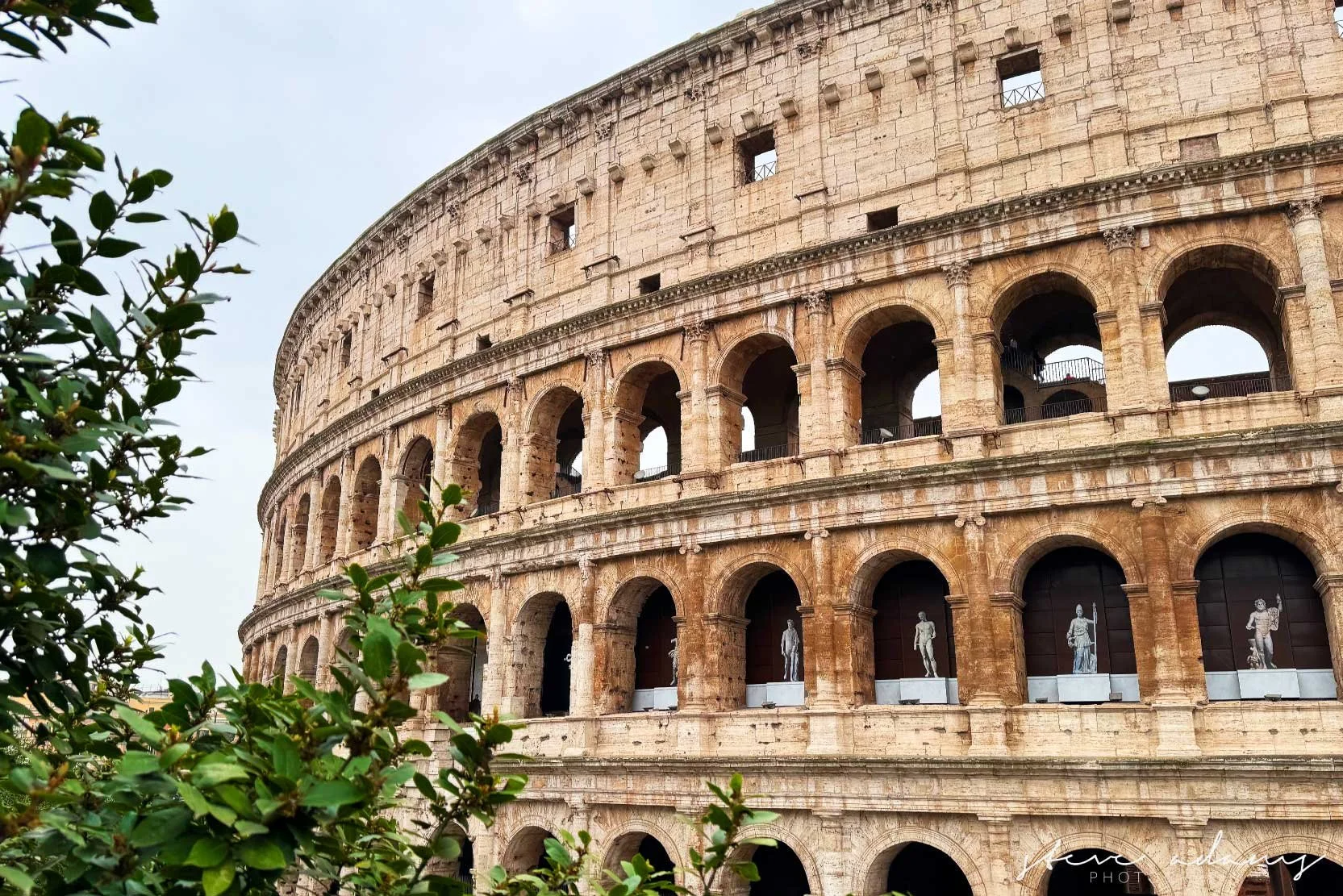
When can oversaturation hide the truth too?
Now, I want to be fair here, because this cuts both ways and I'd be lying if I only picked on one side of it. Cranking saturation all the way up isn't automatically more honest just because it's the opposite of muted. It can hide the truth just as easily, it just does it in the other direction.
I've seen it plenty. A sky pushed to a blue that never actually existed that day. Grass boosted into a green that looks more like a golf course commercial than an actual field. Skin tones shoved so far into orange that a person barely looks like themselves anymore. That's not honesty either. That's just a different flavor of the same problem, dialing a slider until the photo matches some idea of what looks impressive instead of what was actually standing in front of you.
The line I try to hold myself to is pretty simple. Does this still look like the place, or does it look like a version of the place built to stop someone's thumb from scrolling. Positano is genuinely, wildly colorful in real life, so letting that color come through isn't oversaturating it. It's just accuracy. But if I took a quieter, more muted village and cranked the saturation until it looked like Positano too, that would be its own kind of lie, no different than muting a vibrant place down to look like something softer and sadder than it really was.
Oversaturation gets treated like the safe opposite of the muted trend, like if you're not desaturating everything you must be doing it right. That's not true either. Both directions can pull you away from what you actually saw. The saturation slider isn't the enemy and it isn't the hero. It's just a tool, and the second you're using it to impress instead of to tell the truth, you've wandered into the same trap from the other side. Know why you're making every choice you make.
Your eye is the only one that matters
I'll leave you with this, because I think it's the whole point buried underneath everything else I just said. Trends come and go. What's popular on Instagram or any other social media app right now will not be popular in five years. It never has been, for anyone, in any era of photography. The moody, desaturated look that feels unavoidable today will eventually feel dated, the same way every trend before it eventually did.
What doesn't go out of style is a photographer who actually sees things clearly and has the confidence to show you what they saw, without filtering it through what they think will perform well online. That's a much harder thing to build than a consistent aesthetic. It takes longer. It's less predictable. It won't always fit as neatly into a feed. But it's yours, and nobody can take that away from you by changing what's trending next month.
Stay true to what you actually saw and how it actually made you feel standing there, not to whatever the algorithm currently seems to reward. That, more than any filter or preset you'll ever download, is what will actually make your work worth looking at ten years from now.